Overview
A mobile reading app built around one small act: you find a note the last reader left, and you leave one for the next. Taken from concept to a working prototype in a 7-day design competition.
- Stack
- Next.js
- TypeScript
- Tailwind
- Figma
- Claude Code
- DialKit
- Scope
- Product design
- User research
- Interaction & Motion
- Prototyping
- Collaborators
- Joyce Ren
- Joel Lim
- Timeline
- Oct 15 - 21, 2026
Brief
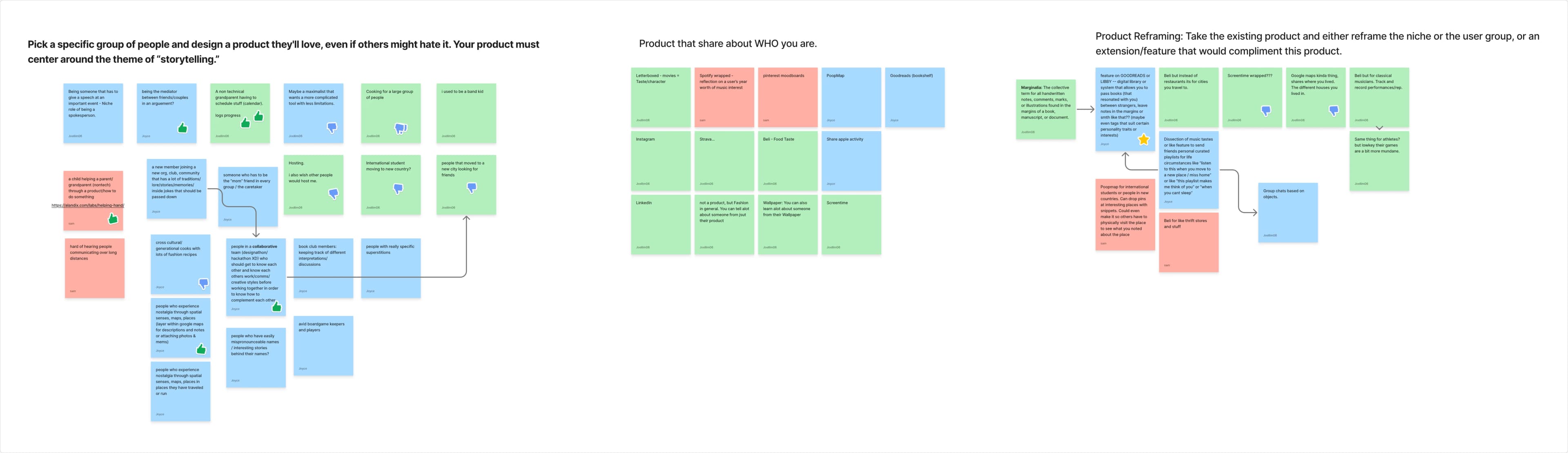
In a 7-day design competition, I led prototyping and worked out the interactions and logic. The one rule: pick a specific group of people and build something they'll love, even if everyone else hates it. The product had to center on storytelling.
Pick a specific group of people and design a product they'll love, even if others might hate it. There's just one constraint: Your product must center around the theme of “storytelling.”
We read storytelling literally at first and kept hitting the same wall. The story was always something the app displayed, never something it let people make. So we flipped it.
Ideation
Woven isn't where we started. The brief left the audience wide open, so we went wide too: kids in hospitals, AAC and ASL storytelling, immigrants holding on to their culture, night-shift workers, people who hoard nostalgia. The one we fell for hardest was families of Alzheimer's patients. An app to catch a person's stories before they faded.
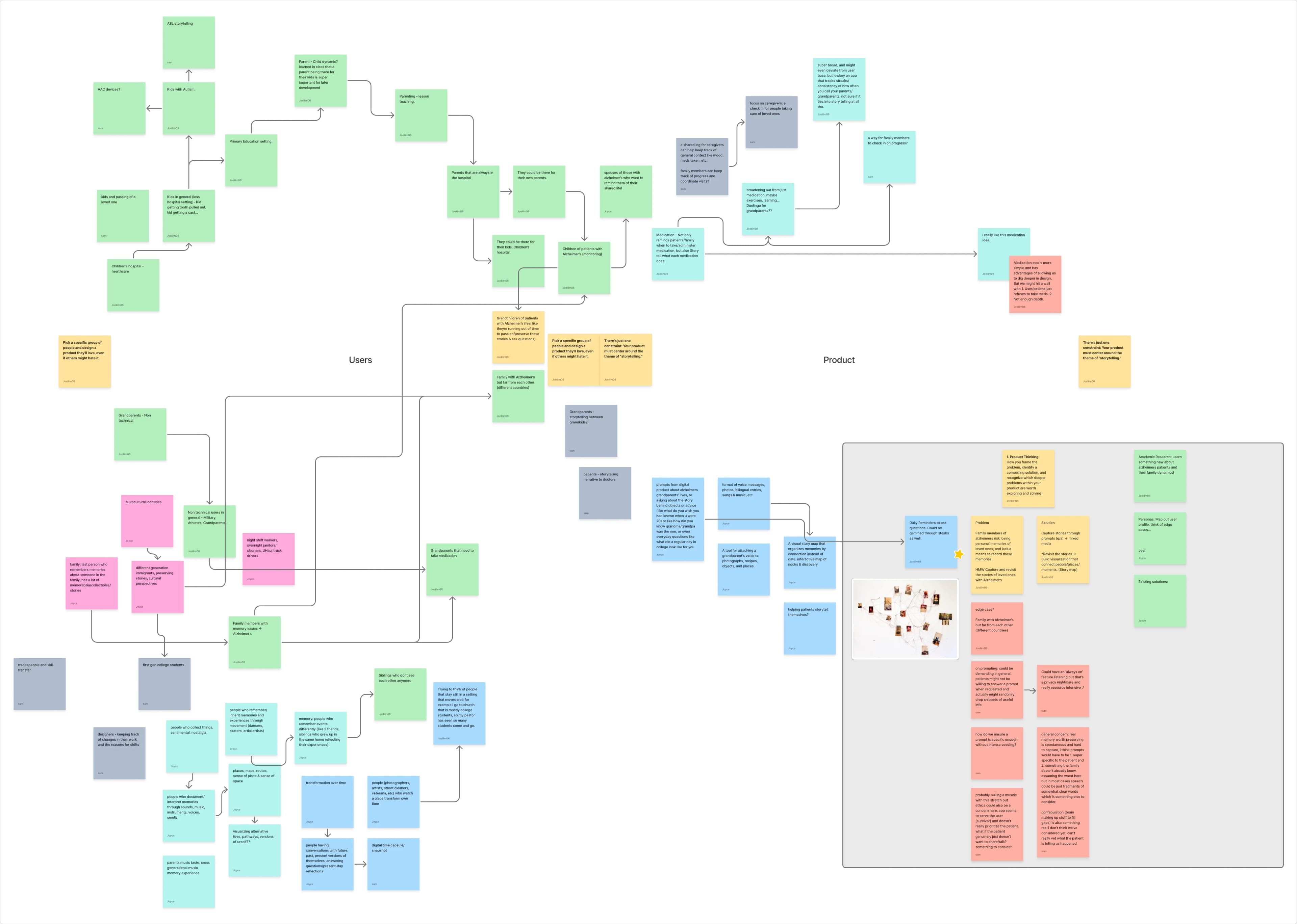
Then we pentested it and killed it ourselves. Real memories show up when they want to. Asking someone to tell a story on cue feels intrusive, and most of the time nothing comes. The privacy and ethics questions piled up fast. And confabulation meant we couldn't even trust what we'd be saving. So we flipped the exercise. Rather than invent a product, we took ones that already work and asked who else they could be for. That's how we got to Marginalia, the real word for the notes people scribble in the margins of books. A shared library where strangers pass along books they loved, each with a note for whoever reads it next.
Features we cut
Our first user flow had a few features that would have turned Woven into one more social app. Cutting them gave it a spine.
Core bet
The decision everything else hangs on. A note you leave is not posted to a wall. It goes to one later reader, at the exact passage that moved you. We rejected the obvious version: a public copy where everyone's notes stack up on every page. That is SoundCloud comments. It turns a quiet book into a comment section, and the fortieth "so true" drowns the one note that was meant for you.
One note, one person does two things at once. It keeps the page uncluttered, and it makes a stranger's attention feel deliberate, like they wrote it for you, because they did.
Keeping it human
Everything here came from one question: how do you make a one-way, anonymous connection feel two-sided and real, without becoming a social network.
A library card, not a profile. You don't pick a username or upload a photo. Woven issues you a library card with your first name and last initial, three genres you read, a signature and the day you joined. That is all anyone sees next to your notes. Enough to feel like a person wrote them. Nothing to search for, follow, or turn into content.
No counts, one reaction. No likes, no reply threads, no badge saying how many people highlighted a line. The only thing you can do with a note is keep it. When someone keeps yours, you learn it landed. That is the whole feedback system.
Highlight and note as one gesture. Early builds had a highlighter tool and a note tool in a dock, two ways to do nearly the same thing. I cut both and moved to the pattern every ereader already teaches: select text, then Highlight or Note float up. Adding a note just highlights for you. One mental model instead of two.
Craft
Four flows shaped most of the design and build decisions: setting up your library card, finding a note in the margin, leaving one, and passing the book on. Each took a few rounds to get right.
Setting up the card. Onboarding is the one place the app asks you to make something, so it got the most care. You pick a color and a shade from a wheel, three genres, a handwriting style and a pattern for your card, then sign it with your finger. The recording is the whole walkthrough.
The welcome animation runs as a CSS blur instead of an SVG filter. The filter version dropped frames on mobile Safari.
Card contrast. Every card is its own color, and its text has to stay readable on all of them. Colors and shades make 144 combinations, and my first rule for picking the ink, going by HSL lightness, failed 71 of them against WCAG AA. That is about half the library with text that quietly didn't work. So I built a small tool that measures every pair against WCAG contrast and marks it green or red, then replaced the rule. The new one measures real contrast and picks the tinted ink closest to the card's own tone that still holds up, aiming for 7:1. If no tint can reach 4.5:1 it falls back to plain black or white. Now none of the 144 fail. Checking that by eye was never going to work. Toggle between the two rules below.
Building with a team of agents
I'm proudest of this part as an engineer. Seven days, a team spread across the country, and most of us vibe-coding with different AI tools, each with its own habits and its own idea of the rules. That usually turns main into a mess, luckily this time it didn't. Here's how I structured the workflow.
It also opened my eyes. We hadn't really thought about collaborative vibe coding like this before.
Reflection
Unfortunately, we didn't make the finalist cut, but working with Joel and Joyce (two amazing people I didn't know at all before this challenge!) under a 7-day deadline was worth it; the constraint forced us to make more grounded decisions than we would have with open-ended time.
Given more time, I'd spend it on the brand. We moved fast, and most of the design decisions were justified by utility. That's not wrong, but software should also be fun to look at. Posters, more motion, a richer visual identity, that's where I'd go next. I'm still working on it between classes.
Two things I'd take from this into the next project: