stampstudio
I just wanted to make stamps this escalated quickly...
Background
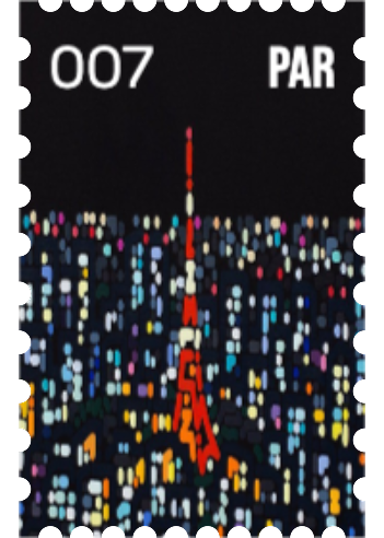
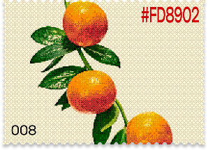
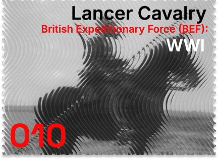
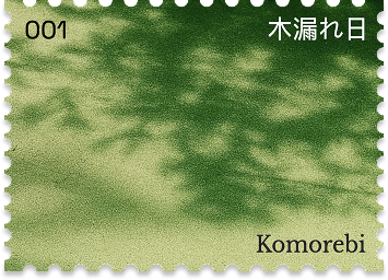
For weeks I'd been doomscrolling Pinterest in the back of lectures. Not really productively, just absorbing; saving things I liked without really knowing why. At some point I noticed a pattern in what I kept coming back to. Stamps. Literal postage stamps, real and fictional ones, vintage ones, modern ones, ones from countries I'd never heard of.
The compositions, the typography, the tiny worlds packed into something the size of your thumbnail. Something about them just spoke to me in a way I couldn't fully articulate at the time. I kept coming back to them.
So naturally my brain went: what if that but digital.
Around the same time, every idea I had felt like a startup pitch before I'd even opened Figma. That felt wrong. So the stamp thing felt like a release valve. Something I could just make.
The first version of the idea was way more ambitious though. I called it soundstamp. The pitch to myself was: tiny embeddable stamps that played music. Instead of the default Spotify "recently played" widget people slap on their portfolios, you'd have this sick little stamp you designed yourself that played a song. Something personal. Something that looked like you made it because you actually did.
Process
I started sketching. Over and over. Some super detailed, others just whatever came out. I was pulling inspiration from everywhere, even hardware surprisingly. Teenage Engineering stuff in particular. It felt natural given how song heavy the idea was at the time.
I even had designs using EQ bars. I wanted it to stand out but also be fun, and a lot of the time those two things conflicted. I was overcomplicating color pickers for the sake of uniqueness, overthinking layouts, sitting on multiple variations of designs I didn't really like any of. None of it felt right yet.
Then Spotify killed off a big chunk of their API access. Real bummer.
There were workarounds — iTunes had theirs open as long as I gave credits, so after a long research spiral I went that route. Built out the whole infrastructure around it. And then the more I sat with it the more it just didn't feel good enough, so I dropped that too. After building the whole thing of course (anything to kill some time through those CS131 lectures).
Eventually I dropped the song idea entirely and just decided to go all in on stamps. I couldn't tell you exactly why. It just felt right. Cleaner. More honest to what I actually wanted to make.
The design side was its own whole journey. I remember at some point I had this idea for a 2D pad control that handled virtually everything. Each knob on the pad was its own thing, and the x and y axes would change contextually depending on what you were adjusting.
So if you were on the color knob, x could be hue and y could be saturation. Different knob, different axes. I thought it was clever. It was, honestly. But clever and intuitive aren't the same thing, and for something meant to feel personal and light, a learning curve is the wrong first impression. I let it go.
I had a bunch of ideas like that. The EQ bars looked clean in theory but didn't translate well outside of music context.
The real turning point was moving to a Fabric.js canvas. The old model trapped images as backgrounds only, so frames and multiple assets per stamp were off the table, and text stacking depended on a layering toggle I never trusted. Canvas gave me one place to handle ordering, images, and frames — which is when the editor finally matched what I'd been trying to build.
The shaders came together around the same time. Shoutout to the team @ Paper: Halftone dots, Fluted glass, Halftone CMYK, Dithering. They had it all.
It connected back to what drew me to stamps in the first place. That physical quality. I had a personal test for this the whole time: if I mixed one of my stamps in with two or three real ones, could someone tell which was computer assisted. With the shaders working the way they were, I think I was getting close.
Outcome
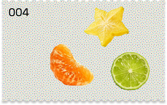
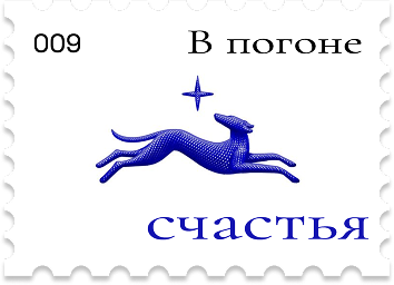
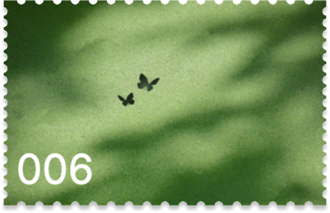
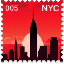
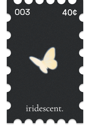
Right now I'm calling it stampstudio. No database, no auth, just a canvas editor where you pick your fill, adjust your perforation count, layer in images and text, throw a shader on it and export.
Simple. That's the whole app. A lot got cut to get there and I think that's the right call.
There's more coming. CD shapes for song embeds, an x-ray/layers view so you can see the skeleton of what you built, maybe music returns one day in a way that feels earned.
The stamp book idea is in the back of my head too — a whole collect-them-all system where stamps people put on their sites can be grabbed and kept. That one's a bigger lift but I think about it.
I didn't build this because anyone asked for it. No one was asking for this. But I think that was the point.
I'd spent so long trying to make things that justified their own existence to someone else that I'd forgotten what it felt like to just make something. Something small and yours that lives on the internet. Something that looks like a person made it because one did.
That's still what I'm going for.